


The carefully curated colors of Paris
Plus a Q&A with Paris-based illustrator Jessie Kanelos Weiner

As an artist, I am always thinking about color. Specifically, how to capture the colors of a city — the way the sun dances acros the Seine or how the fog on a cold wintery day covers the city in a grey blue mist. So it’s no surprise that I have a specific color palette of colors I turn to time and time again when I am sketching in Paris.
The colors may vary slightly depending on the season. After all, grey is one of the dominate colors of Paris winter, while the pink cherry blossoms in spring liven up any painting.
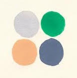
But there are four colors I turn to often, no matter the season or time of day — light grey, ash blue, dark emerald green, and beige (or sometimes Naples yellow, if the sun is shining just right).
But while it might seem like these colors are just an artist preference, I’ve realized after doing a bit of research that Paris has a carefully curated color scheme that goes back to the 19th century.
Although the official colors of Paris are blue and red, drawing from the Middle Ages, the city itself shows very little accents, other then an occasional French flag here and there.
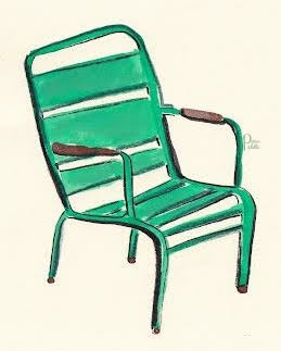
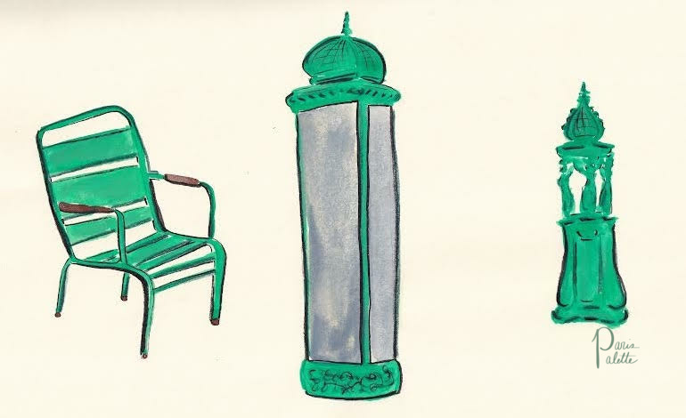
If you think of Paris today, what likely comes to mind are the wide avenues, large Haussmann buildings with their sandstone edifice, floral accents and statues of the greek muses. Perhaps you might wonder to the parks, with their dark green chairs or the Wallace fountains painted the same shade of green.
The stereotypical picture postcard view of Paris is uniform, gorgeous, and was largely thought through to completely modernize France’s capital during the 19th century.
Essentially, in the long history of Paris, the stereotypical view of what Paris looks like is relatively new.

My carefully curated Parisian palette has one man to thank — Baron Georges Eugène Haussmann. While today his vision of Paris has made the city one of the most popular tourist destinations in the world, he was very controversial at the time.
Largely because thanks to his vision, entire neighborhoods were destroyed, rivers paved over, and the Parisian lifestyle reinvented.
Part of that vision was having a uniform city that looked similar. And as any artist knows, the best way to bring together a painting (or in this case, a city), is to have a carefully chosen color palette.
Haussman’s lasting legacy is what we call the Haussman style buildings — those sandstone buildings of the same size, with slate tile roofs, uniform windows and accents of brown.
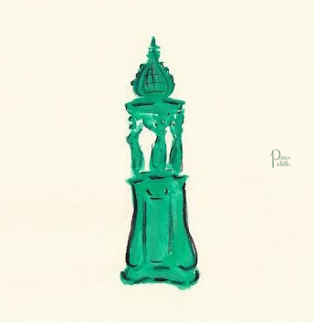
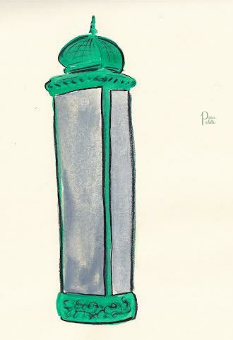
But what about the Paris municipal green, that dark emerald nearly forest green that marks nearly every park bench, lamp post, and metro sign in Paris?
Unfortunately that history is a bit more elusive and seems to be more a typical French case of “it’s tradition” than a real answer. Some say it has to do with the color of the carriage Louis XVI was in before he was beheaded. Others seem to think it’s to bring a bit of nature to the city. And some say it’s due to Hector Guimard, who designed many of the city’s metro signs.
Regardless of the real reason (which I hope to uncover one day), that dark Paris green remains one of the colors I turn to most in my drawings and the one that reminds me most of the place I currently am lucky enough to call home.

Since this month is all about color, I thought I’d ask an illustrator friend of mine her take on color in Paris and how the city inspires her.
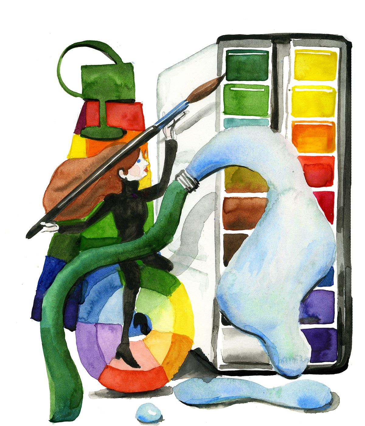
is an American illustrator and comedian based in Paris whose watercolors convey the stylistic yet quirky French humor. I’ve been an admirer of her work for hers, as she has such a creative and fresh way of conveying concepts, from pigeons competing at the Olympics, to 3-D watercolor models of the Paris. Her most recent book, Thinking in Watercolor, is a 30-day masterclass in tackling watercolor to tell your own story. Her book comes out on March 4 and if you preorder before, you’ll receive a free watercolor class primer to start practicing.Interview with Jessie Kanelos Weiner
What are your favorite colors in Paris?
Jessie: Paris has the extremes between the grey autumn/winter months and the obnoxiously colorful spring/summer. It's very Wizard of Oz. I'm a colorist and live for the spring flowers and market produce.
If Paris were a color, what would it be?
Jessie: At the moment, I'd say grey unfortunately. Otherwise I'd say the cream-colored Lutetian limestone of the buildings.
How does Paris inspire you as an illustrator?
Jessie: I decided to move to Paris for what I thought would be a one-year Audrey Hepburn fantasy of glamor, high culture, and an escape from the 2008 financial crisis. But it sadly was not that. Paris can be dirty, cold and has an unshakable Old World funk to it. I started drawing the clichés and disenchanting world around me as a means of coping and finding the humor amongst it all. I ultimately found my voice here. As my life evolves, I still find inspiration in the everyday life within the city's contradictions.
Where’s your favorite place to go in Paris for inspiration?
Jessie: I've become very French in the way I love my rituals. If you do the same things everyday, you can compare and contrast the season and the local cast of characters. I love shopping at my local outdoor market in Vincennes. And run around our local chateau almost every morning.
You’ve written a book about creativity and watercolor. What can readers learn about color from your book?
Jessie: Unlike most watercolor instruction books based on rote copying of classic watercolor subjects, Thinking in Watercolor encourages readers to use watercolor as a means of self-expression.The book holds your hand through the whole process, including encouraging words, how to spark creativity, develop your own personal style and use color intentionally.
How do you find inspiration when you’re in a creative slump?
Jessie: I like to say that I don't get inspired, I stay inspired. Since I do a lot of different things in my artistic practice (writing, illustrating, painting, teaching, standup comedy), I work interchangeably between each medium. If I'm not inspired with one, I can take a break doing another. Maybe this is my French influence speaking, but sometimes it's best to not work to get the creative juices flowing again.

The Wallace Fountains

In 1871, Paris was in ruins. Besieged for four months during the Franco-Prussian War, buildings were hallowed shells of themselves, rubble lying in the streets. The Parisians were emaciated, resorting to eating whatever they could find. Even the city’s beloved pair of elephants, Castor and Pallux, stood no chance and were slaughtered for their meat.
I found that things looked more parisian when I made them black-and-white like the pianist in this story. As for inspiration, I was looking hard but there wasn’t any, but then I found it far from the center! https://open.substack.com/pub/nomadicmind/p/paris-propriety-and-urban-rebellion?r=31fxoh&utm_medium=ios
Sorry for a pedantic note on a great post: blue and red are not the colors of Paris since the revolution, they were so since the middle ages. The tricolour was invented by combining the blue and red of Paris with the white of the monarchy in the early days of the revolution.